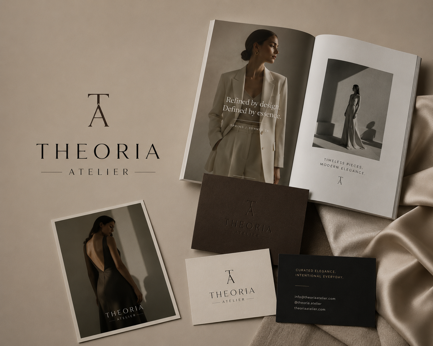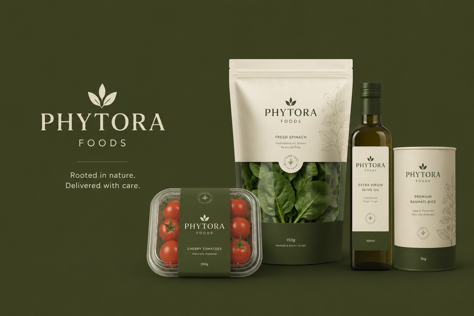
Phytora Foods had spent years building a business that worked. Their operations were dependable, their sourcing relationships were strong, and the quality of their produce had earned them the trust of distributors, retailers, and commercial buyers who valued consistency.
What had not been figured out was how the business looked to the outside world. The business was functioning well, but the identity around it felt generic. Packaging served a purpose but carried no real distinction. Messaging was direct, but forgettable. Their website existed, but it did little to communicate the confidence, maturity, or professionalism the business had actually built.
The challenge was never product quality. It was perception. Buyers were not simply purchasing agricultural produce. They were buying reliability, consistency, trust in timelines, sourcing, freshness, and confidence in the people behind the business.
Hubexia refined the visual identity to feel cleaner, sharper, and more intentional. Packaging was redesigned for stronger shelf presence. Messaging evolved from transactional language into something clearer, warmer, and more human. The website became a proper business touchpoint that helped prospective partners understand not just what Phytora offered, but why the company was worth trusting.
What Hubexia delivered: brand discovery and strategic positioning, messaging refinement, visual identity evolution, packaging design system, website redesign, and product communication framework.
Phytora Foods emerged with a brand that finally matched the quality of the business behind it. Sales conversations became easier, products felt more credible in competitive environments, and new buyers could understand the value proposition much faster.